
When designing presentation slides, you need to find a balance between keeping the interest of your audience and maintaining their attention, while not distracting them from your key message.
The aim of presentation slides is to enhance learning and understanding, by supplementing what you’re saying (not be the main focus of your talk).
Below we discuss the best practices for designing presentation slides.
Keep it simple
If your slides are more important than what you’re saying then your message will lose impact. Your slides must be an accompaniment and not distract from your words.
- Avoid slides with lots of text, especially if it’s just a repetition of what you’re saying. The audience may be reading rather than listening to you. If you need text-heavy slides then gradually reveal the text when needed.
- Ideally you should only include main speaking points in the form of short and concise bullet points on your slides. This is far less dull for the audience and the best slides have no text – some speakers just use images.
- Don’t fill up empty spaces with unnecessary elements as this won’t help the audience understand what you’re saying. The less clutter there is on a slide the more impact your visual message will have.
- The design elements should be kept to a minimum to prevent distraction, such as, ensuring you have a clear and simple background.
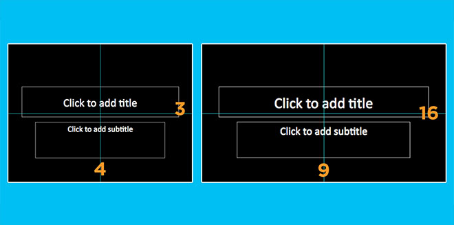
Decide your presentation’s slides ratio
You must decide which ratio for your slides will best suit the context of the presentation:
- A 4:3 ratio if beneficial for presentation slides that need to be viewed across multiple devices.
- A 16:9 ratio should be used conference presentations.
Consider creating your presentation slides in both sizes to be prepared.
Have a title page that stands out
Create a visually engaging title page so the audience is interested and ready to listen before you begin speaking.
Limit transitions and animations
Using lots of animations is distracting and amateurish. It doesn’t add much meaning to your presentation and it’s boring for the audience if they are watching constant animation. It can also be problematic and frustrating to view the presentation on different devices due to this.
- Only use animations for a purpose, such as, to reveal the stages of a process.
- Your animations should subtle and professional, for example, “Wipe” is effective for introducing bullet points but “Move” and “Fly” are too slow.
- Don’t animate every element in your slide.
- Avoid using animations between every slide and don’t use more than three different types of animations for this.
Use visual aids
Visual aids are chosen depending on their purpose, for example, you may want to:
- Summarise information.
- Reduce the amount of spoken words.
- Clarify and show examples.
- Create more of an impact by making the audience feel a certain emotion.
- Emphasise what you’re saying.
- Make a point memorable.
- Enhance your credibility.
- Engage the audience and maintain their interest.
- Make something easier for the audience to understand.

We go into detail on specific visual aids later in the article but here are some general tips for using visual aids:
- Think about how can a visual aid can support your message. What do you want the audience to do?
- Ensure that your visual aid follows what you’re saying or this will confuse the audience.
- Avoid cluttering the image as it may look messy and unclear.
- Visual aids must be clear, concise and of a high quality.
- One message per visual aid.
- Use visual aids in moderation – they are additions meant to emphasise and support main points.
- Ensure that your presentation still works without your visual aids in case of technical problems.
Read our article on Using visual aids during a presentation for more information.
Use high-quality graphics
If you want your presentation slides to look professional then you need to use high-quality graphics. Main points can be illustrated with images but these images shouldn’t be a stretched low-resolution photo as this will look sloppy. Also, avoid using Clip Art as it’s likely the audience has already seen the images and it generally looks unprofessional.
Photographs are particularly valuable to enhance understanding because they allow the audience to see what you’re saying. Ensure that you use simple photos that relate closely with your speech.
Find free stock photos here:
Alter images to focus on elements
If an image is not the focal point consider decreasing its opacity and if it’s the current focus then make the image more pronounced. Masking can be a useful way of achieving these results and it can also be used to direct attention to something important within an image. It looks more professional than highlighting or using arrows etc.
Use panning for large images
You may want to show a large image in your presentation, such as, a web page. Consider using the Chrome extension to capture this. This will prevent you from scaling the image and distorting it. Instead you’ll be able to pan as you talk about it.
Use suitable charts and diagrams
Present data using charts and diagrams because they display data in a visually compelling way and you’ll avoid overwhelming the audience compared to, for example, presenting a list of statistics. Select data most relevant to the points you’re making and ensure that your charts are necessary.
- Horizontal bar charts should be used for comparing quantities.
- Vertical bar charts are for displaying changes in quantities over a length of time. There should be a maximum of eight bars.
- Pie charts highlight percentages. They should include a maximum of six segments.
- Line charts show trends.
- Tables are useful for side-by-side comparisons of quantitative date but charts are generally better as they are quicker to understand and they clearly emphasise significance.

Use video or audio
Using videos and audio clips are a great wait to engage the audience and increase their interest because they introduce a change of pace and they enhance understanding.
- Ensure that any videos or audio clips used are relevant to the presentation’s content.
- Only play as much of the clip as necessary.
- Never show a really long clip.
- Video and audio can be difficult to fit into the structure of a presentation so ensure that you tell that audience why you’re playing them a clip and tell them what to look for or listen out for.
Avoid using autoplay for videos
With autoplay it can take a moment for a video to start playing which can lead to the speaker clicking in this time. This causes the slideshow to move on to the next slide rather than playing the video. Instead of allowing autoplay ensure that you have to click something for the video to play as this will give you more control.
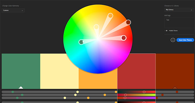
Use colour
Research suggests that using colour increases people’s motivation to read and their enthusiasm for a presentation. Colours also evoke emotions and can improve understanding by, for example, highlighting certain themes in specific colours.
Using the colour wheel can help when choosing your presentation’s colours: insert picture of colour wheel
- Colours opposite each other in the wheel are complementary and they create contrast. Using complementary colours makes your text more readable and it allows you to draw the audience’s attention towards desired elements.
- Colours next to each other are analogous and they are harmonious. Using analogous colours makes your presentation more unified.
Avoid using too many colours in your presentation as this can look cluttered and unprofessional and keep your colour themes continuous, for example, if you use the colour blue to highlight all the key words on your second slide continue to do this throughout the presentation. Also be careful with colour associations, for example, in many cultures red is linked to danger. Try to represent your words and topics with “appropriate” colours that make sense.
Many people are blue-green or red-green colour-blind so avoid putting these colours next to each other in, for example, a graph. If you cannot avoid placing these colours next to each other then use text to clearly label items.
There are websites that can help you pick colour schemes, such as, Adobe Color CC shown below.
Choose fonts carefully
Use the same clear fonts throughout your slideshow and use no more than two fonts that go well together. Avoid using Serif fonts, such as Time New Roman because: they’re designed to be used in text-heavy documents, they’re easier to read in smaller sizes and they cannot be seen well when projected. San-serif fonts, such as Arial are usually better for presentations.
A popular choice of font is Gill Sans but whatever font your choose make sure it looks professional and can be read from the back of the room.
Avoid using custom fonts that are unlikely to be on all computers because this can be problematic on the day of your presentation.
Use large font sizes
Your font size should be a minimum of 24pt so everything can be easily read. Ensure that you keep font sizes consistent throughout the slides or it can look messy.
Create consistent slides
The slides should have the same design, including colour scheme, font size, font type, etc. This makes the presentation flow better and emphasises that each slide is part of same story you’re telling so this consistency will help with understanding and it’s less frustrating for the audience.
However, some speakers like to have one style for the main slides and other styles for transitions between topics, for example, you may switch around the background and text colours for transition slides so it feels like part of the same presentation but it shows the audience that you’re moving on to a new theme or subject.
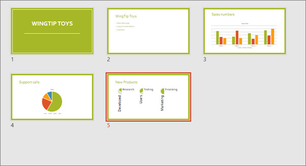
Sort your slides
Use the Slide Sorter view to confirm that your presentation’s structure is effective. Slide Sorter shows you how logical the flow of your presentation is and it’s easy to re-arrange your slides in this view.
Include white space on your slides
Empty space is needed on your slides or it will look too cluttered. Make sure that you have empty space between each element in your slides. Don’t try to fill the white space unnecessarily or you’ll reduce the significance of your points.
Premade templates
Experts do not agree on the use of premade templates but if you do use a premade template, ensure that there is consistency and that it looks professional.
- Presentation templates which you can download and use
Presentation slides come last
Design your presentation slides after deciding on your message and your supporting evidence. Remember that the slides enhance the experience but the actual speech needs to stand out on its own.
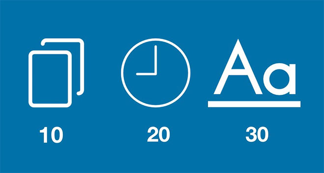
10-20-30 slideshow rule
Guy Kawasaki, an entrepreneur and author, suggests that slideshows should follow a 10-20-30 rule:
- There should be a maximum of 10 slides – people rarely remember more than one concept afterwards so there’s no point overwhelming them with unnecessary information.
- The presentation should last no longer than 20 minutes as this will leave time for questions and discussion.
- The font size should be a minimum of 30pt because the audience reads faster than you talk so less information on the slides means that there is less chance of the audience being distracted.
Summary
The above are common preferences rather than absolute suggestions – you have to design your presentation slides in a way that works best for you and the situation.
You must take into account the type of person you are, the characteristics of the audience, your topic, the context of your presentation etc. All of this will affect what you find suitable for your presentation’s design.


